Product Designer
UI/UX
User Research
Due to the sensitive and confidential nature of this proprietary material, some screens have been simplified, blurred, or negated.
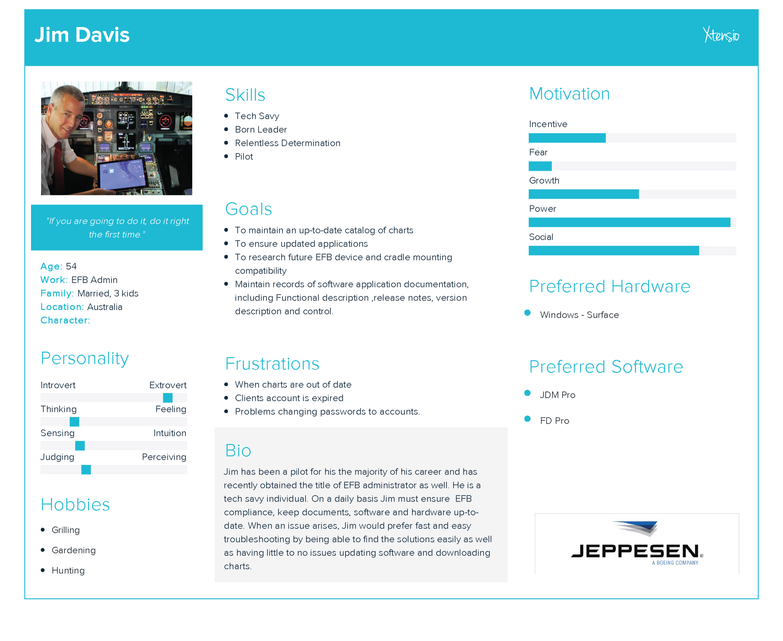
Jeppesen is a leading aviation company, recently separated from Boeing, renowned for providing critical navigation data, flight planning software, and aeronautical charts (paper and digital) that enhance safety and efficiency for commercial, military, and general aviation pilots worldwide, offering everything from instrument approach plates and airport diagrams to terrain databases and global flight tracking solutions. I have worked across several teams as a Lead UX to help understand business and pilots needs to maintain, fly with, and service their data ensuring safe flying.

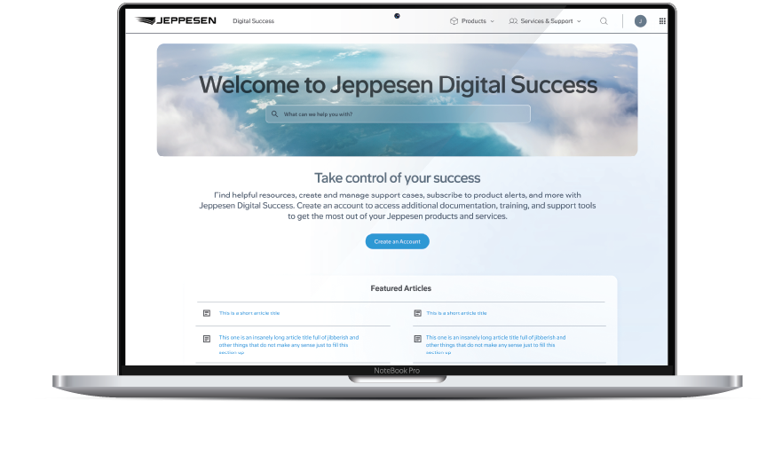
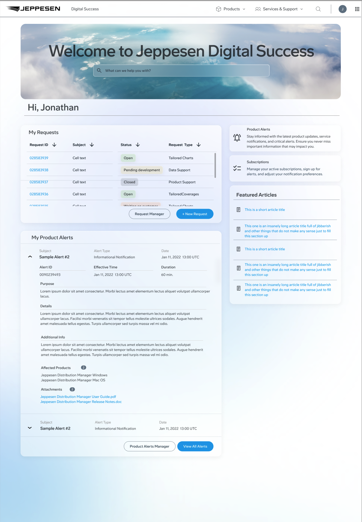
DigitalSucces.Jeppesen.com & Our New CRM
Objective
The company was separating from Boeing as well as utilizing an old technology stack with surmounting tech debt, inability to scale properly, building customer frustration, internal process issues, in-efficient agent support and a step-behind AI, they needed a new platform & CRM to meet industry and tech standards. This endeavor was not just customer support focused, but included a more transparent view of the customer’s account, their products, agent assistance, AI models to help both agents and customers(self-help) and more reliable and accessible communication and management system for all.
Step 1: Analyze the current site and align user needs with business and tech capabilities. Next was to review and understand the newly decided framework which this new site would be built upon and identify any similarities and gaps in needs and design systems. I ended up building a POC in SF Experience Cloud to validate my research and to understand its capabilities and limitations making conversations with the dev team easier. Next, I worked closely with the solution architect to aid in identification of components, environments and integrations, needs for this new site.
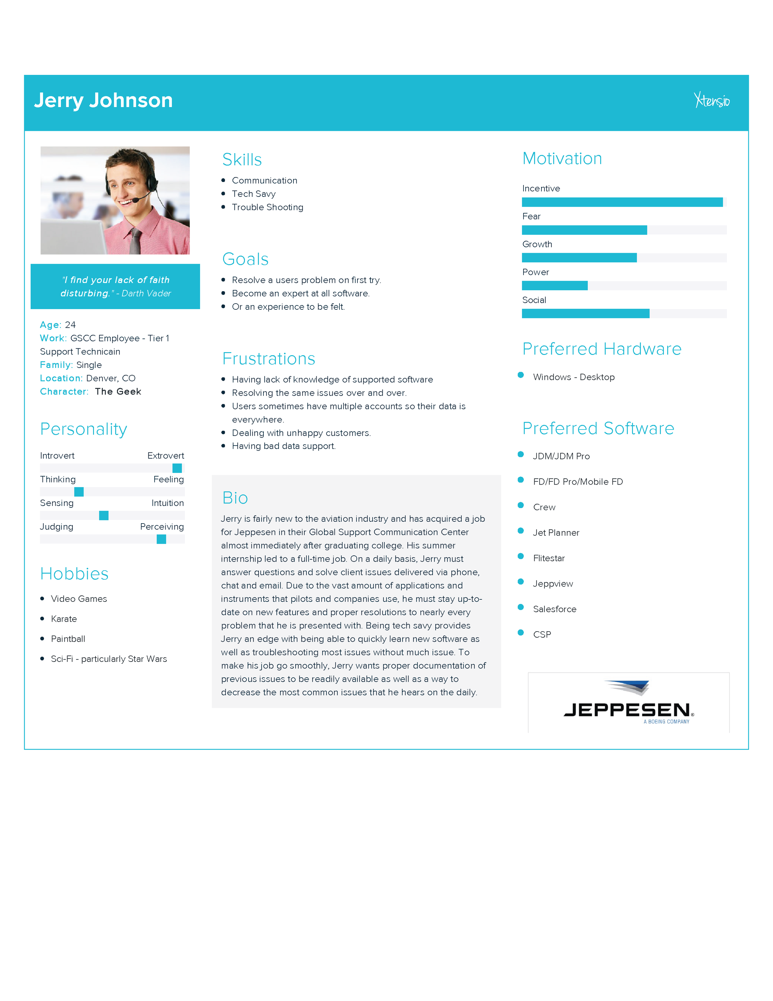
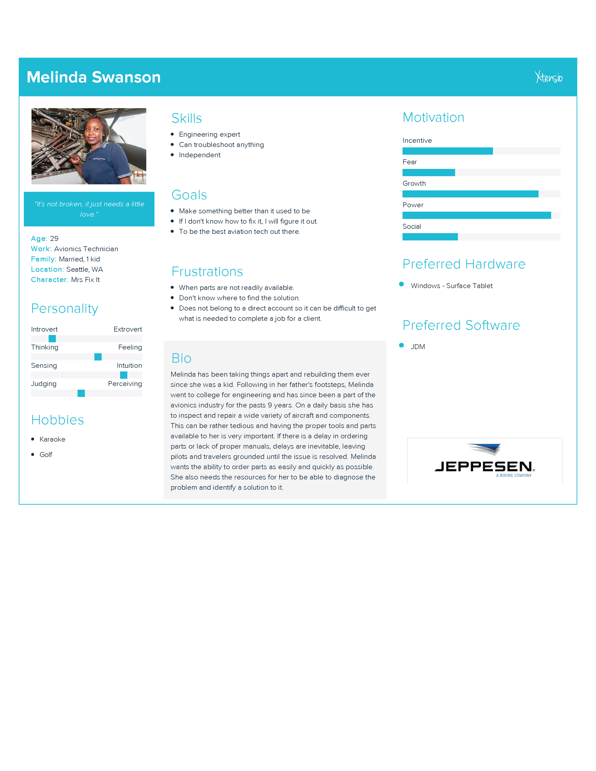
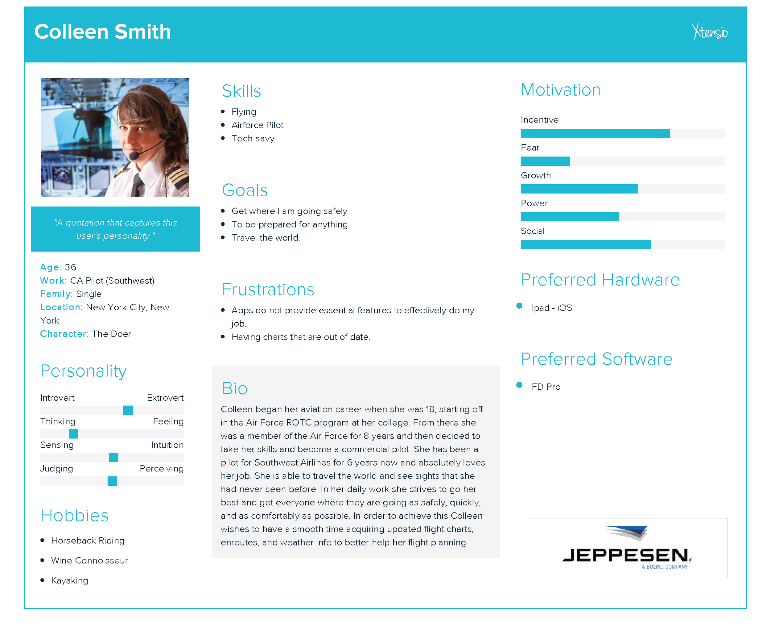
Research, Analysis, and Personas
There was a first initial research phase revolved around previous features, customers needs and what to keep in our ‘lift & shift with improvement’ aspect for the primary features for the MVP version that will then be iterated on. This allowed us to retain primary functionality for users while building a scalable and responsive foundation to allow for a more immersive experience than before. This designs also had to take into account an infant design system, still under development and without web consideration, as well as working within the constraints of the Salesforce Design System (SLDS.)


Flows, Mockups and Prototyping
User flows were developed and wireframes to make sure all features of the tool were taken into account. This does not guarantee that everything made it into our MVP version. This was accompanied by prototypes and user testing to validate our decisions. In our design phase we set out to simplify the design and streamline the interactions. There had been numerous excess clicks, improper info architecture, and unneeded movements that a user had to navigate to complete their tasks in the previous site.


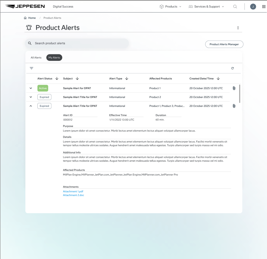
The new design allows for not only internal alert creation and sending(old tool), but is enhanced with scheduling, draft creation, alert editing, previewing alert before being sent, searchable distribution lists, CRM integration, and tool analytics.
Early user testing was done with non-coded prototypes created in Figma to validate user flows, and the UI look and feel. Some new requirements were generated based on user feedback and requests for additional functionality. These changes were made to the designs and retested with users. After the updates and designs were validated both internally and with eternal users we proceeded to begin development work in our lower sandboxes.
Build
The build phase of the project utilized the advanced features and beta developer mode in Figma for shareable flows, designs, components, and HTML/CSS. Close collaboration with the development team and QA assured designs were being implemented and executed appropriately but also with technical limitations in perspective. We were able to develop a POC, followed by a full featured app in lower environments for UAT. Once UAT was completed and some new requirement adjustments happened and performance issues were addressed, we altered our designs and code and polished off the project.


Testing
Thorough testing was done along-side our QA to validate designs, performance, and usability. After our in-house testing we brought in some of our most valuable and trusted customers for UAT.
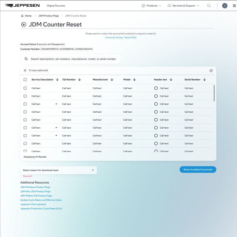
Tailored Charting and Coverage Requests (TCCR)
Objective
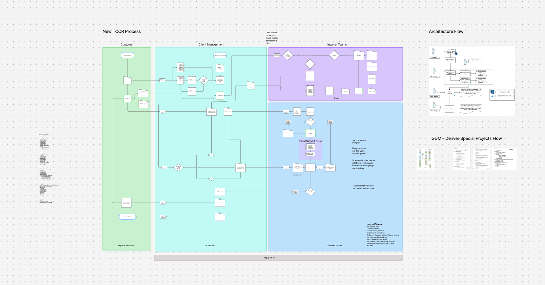
This project was directed at one of our most important aspects to our company and that being Tailored Flight Charts and Coverages. Large commercial companies tailored and craft their charting data and coverages to their companies needs and a lot of this is a foundation for a safe flight. The current process the company had was intake via email. This held a very old archaic method to managing this process and it also left tracking and history to varying email strings. The task was how to create an intake process that removed emails from the situation, created a standardized process, provided tracking and statuses, transparency to the customer, and removed the need for clarification and back-n-forths to understand the customer’s request.
Step 1: Understand the stakeholders that are involved in this process to gather requirements and standardize a process that differs in 3 different worldwide regions. Then find similarities and work towards a common process, terminology, and info needed from a customer.
Research, Analysis, and Personas
We sat down with internal stakeholders to understand what their pinpoints were when communicating with the customer and then compared our results from interviewing customers about their process for these requests and the positives and negatives.
Process & Flows
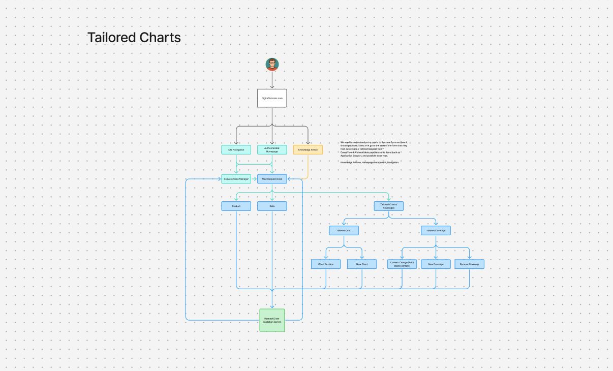
One of the major things needed for this new feature was a process flow and understanding of how individual interactions were now going to be handled within the new software feature. I worked with our stakeholders to understand where these interactions occured, how they would fit into this new process, and test this process in the early stages to validate the direction and ensure this tool can work properly for our users when they need it.
Wireframing & Prototyping
After understanding the process and how customers would be interacting with this feature to how internal teams would be working together, we started gathering the requirements surrounding what info needs to be collected, interacted with, distributed and most importantly where.